


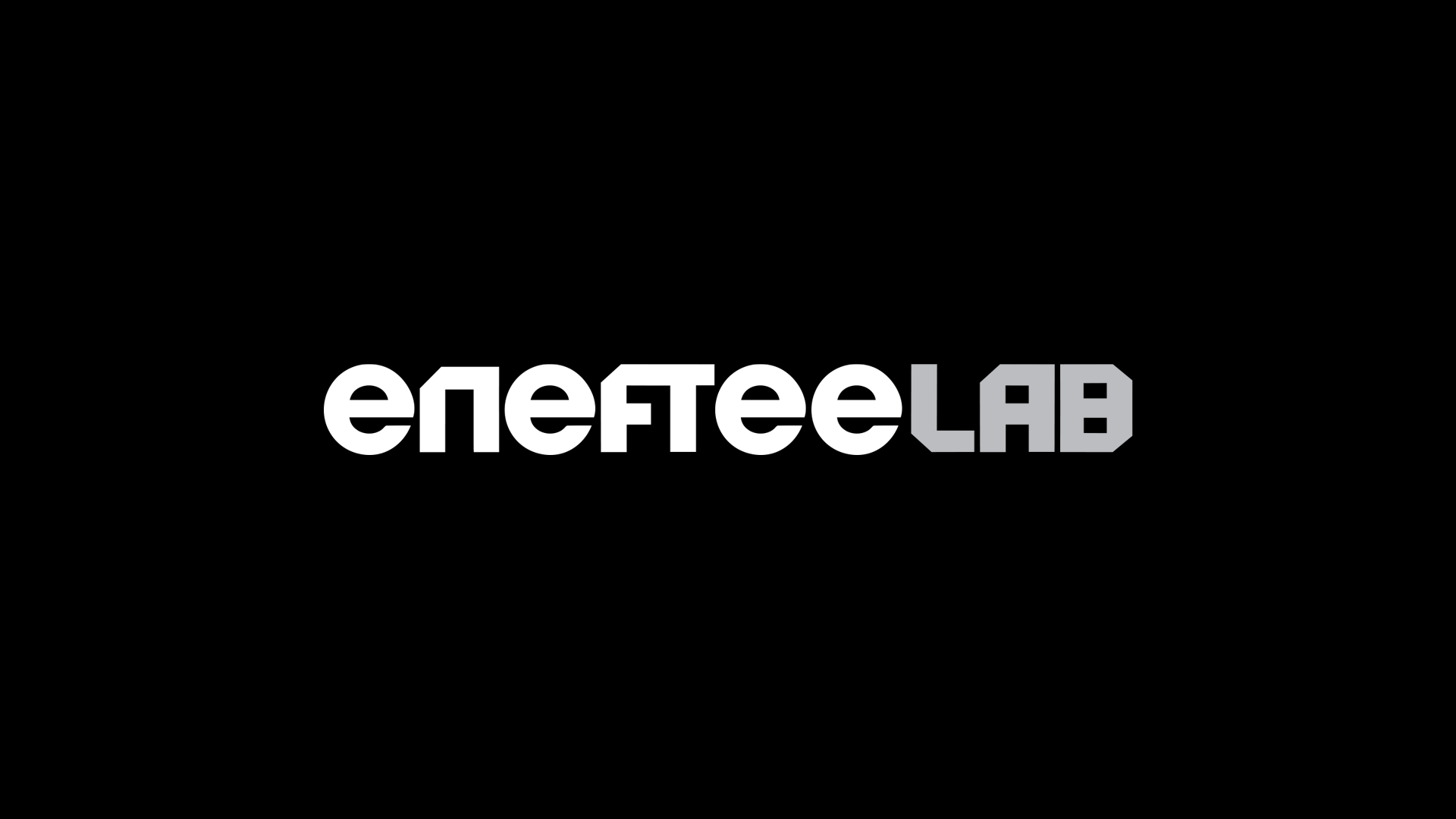
enefteelab: A Visionary Brandmark for Navigating NFT Innovation
For enefteelab, a pioneering incubator and launcher of NFT projects, we embarked on a mission to shape a brand identity grounded in trust, credibility, and a forward-thinking spirit. At the heart of this identity was a custom typemark that exuded confidence and poise, with a clear nod to the future, all while maintaining a fine balance to avoid being overly stylized.
A Typography Challenge and Solution
The brand name itself, ‘enefteelab,’ presented a unique challenge. It incorporated the letter ‘e’ as an empty character, symbolizing NFT, and this clever morphology, though conceptually rich, posed challenges for legibility in various contexts. To overcome this, we meticulously crafted a wordmark that embraced two distinct forms, enhancing legibility without compromising on its unique, futuristic style.
The Power of Sharp and Rounded
By harmoniously blending sharp forms with rounded accents, we achieved a final visual that is not only memorable but also effortlessly readable. The bold, solid typeface imparts a sense of stability and reliability, crucial in the fast-evolving NFT landscape. The use of lowercase letters adds an approachable dimension to the brand, making it feel open and inviting; traits very much needed in a domain that can even scare away tech enthusiasts.
Custom-Made for Impact
Our custom-developed bold typeface boasts a clean and robust form, ensuring high visibility in diverse environments. This typemark was meticulously designed to embody the essence of Enefteelab—innovative, reliable, and poised for the future. It serves as a beacon, guiding the brand through the ever-evolving NFT landscape with confidence and distinction.”
Project Scope
Identity design
Logo creation
Messaging and tone-of-voice
Brand guidelines
Implementation and roll out