A brand new website to digitize, and disseminate daily market updates.
Rebranding and development of a digital experience to disseminate daily market updates
The Pakistan poultry industry, despite being the second biggest contributor towards its GDP, has been slow to adopt the latest technologies. Most importantly the power of the web. With the goal of digitizing industry data, Agbro intended to change this by disseminating timely market data to the countless farmers and stakeholders. Not only would this allow for better decisions on part of farmers but also enable them to take a more strategic approach towards their operations; thereby increasing their ability to counter the highly volatile nature of this industry.
Our first challenge was to develop a new Agbro website that would support the company’s product line, the areas that company was active in, and up to date market information. For this website, we focused on three key principles – easy and simple access to market information for end users that lack IT skills, clarity of design, and optimal execution on all devices & screen sizes – delivering a streamlined website structure that engages audiences with smooth workflows and an easy way to contact the Agbro sales team.
With the requirements gathering phase complete, we set out to rebrand and design each corporate element from scratch. This was an essential part and would not only ensure a more cohesive and solid web design but would also allow Agbro to instill its brand and corporate vision amongst its team members. To this end we developed complete brand guidelines along with a new logo.
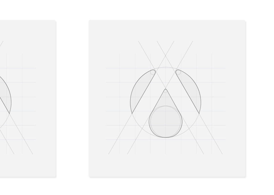
01 Brand Building
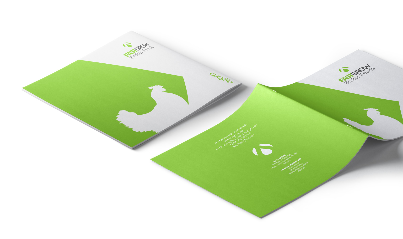
With a strong emphasis on minimalism, the client wanted a logo that was both iconic and abstract. Given the company’s line of business, the logomark represents the three core areas that the company maintains its operations in, namely poultry breeding, hatching and feed milling.
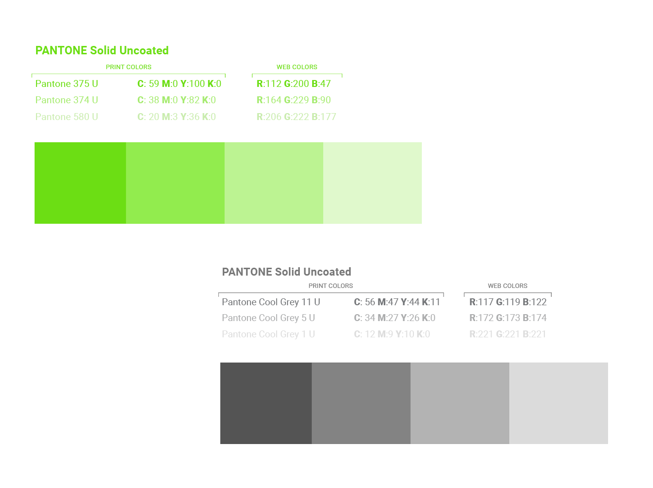
01 Corporate Color Systems
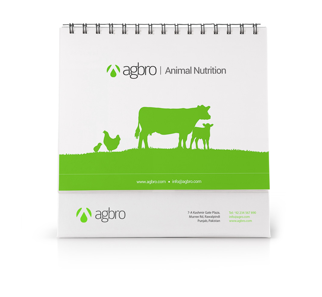
As a group, Agbro aims to serve more than just the poultry sector and as such wanted a color that was more in line with the agri industry. We decided to use shades of fresh green as the primary colors and hues of grey to achieve this while still maintaining a very corporate feel.
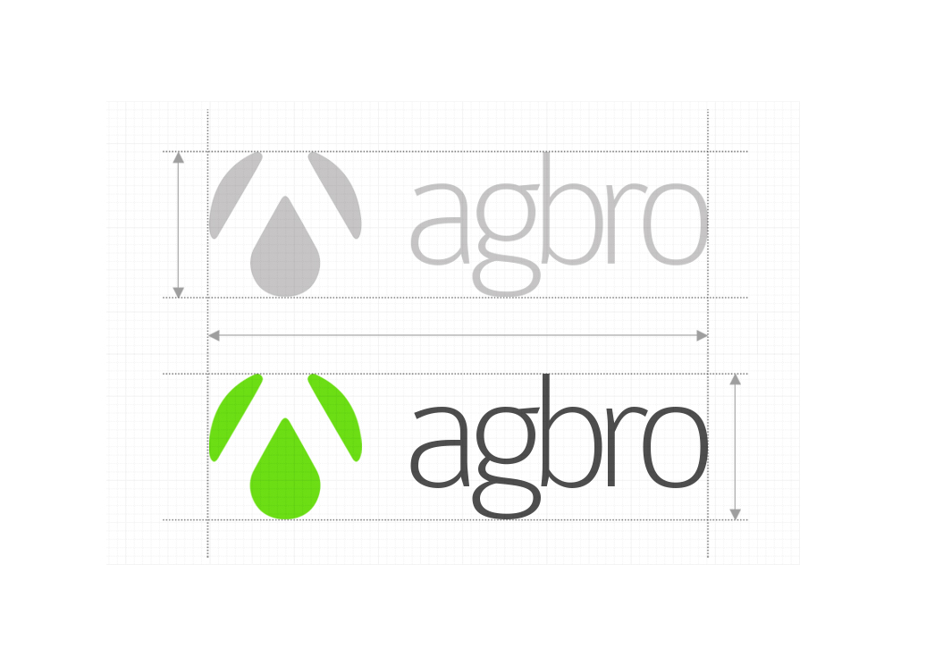
03 Logomark & Type
The primary goal with this project was to come up with a logo mark and type that came off as friendly yet corporate. Given the wide range of contexts in which the brand assets were to be used, we paid special attention to making sure that the logo-mark was both iconic and minimal. With a long term vision of diversifying into several industries, the team over at Agbro specifically wanted a logo that could be used throughout its businesses, regardless of industry.


04 User Interface
Keeping the end-user in mind, usability and ease of access were prime goals for this particular project. With the majority of poultry farmers still lacking in IT skills, we had to come up with a layout that would put the core content within reach.
The simple UI and the use of white space all lead the user’s attention to the information that matters; while the sans-serif typeface ensure readability on all devices. The number of mobile users for this site were much higher than we had anticipated and the responsive design and elements ensured high levels of usability for such users.
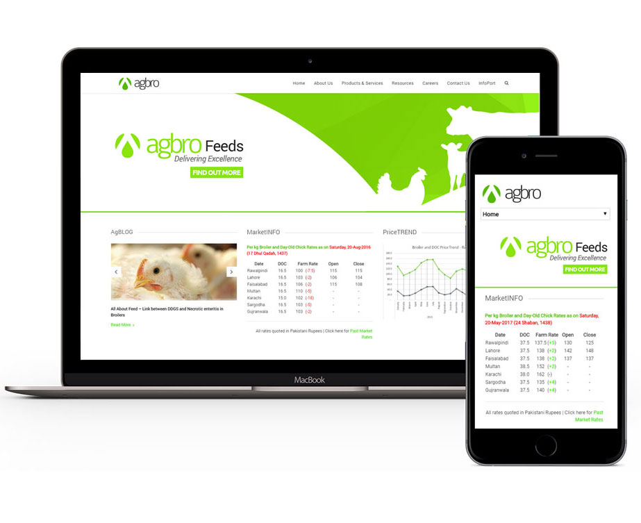
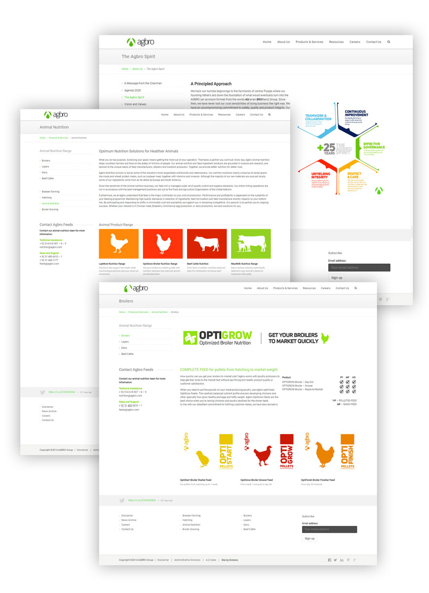
Our visual approach for this particular project incorporated clean lines, subtle interaction effects and ample whitespaces to convey Agbro’s modern approach towards poultry while maintaining a corporate feel to the website. Throughout their journey, visitors are presented with a clear navigation, enabling them to easily discover Agbro’s products and services.
With most website users in this case not well versed with the latest online platforms, we went with a simple tabulation of market data. Since most farmers in Pakistan already use tables to maintain flock data, presenting market information in this manner was a suitable option compared to a more sophisticated system.