


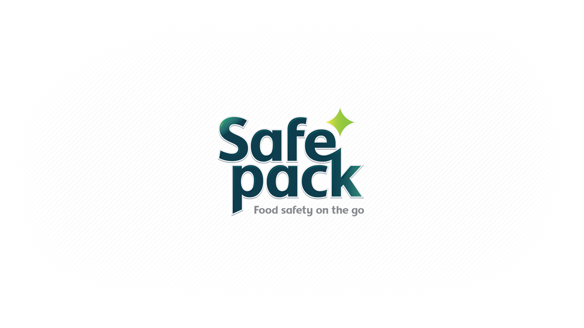
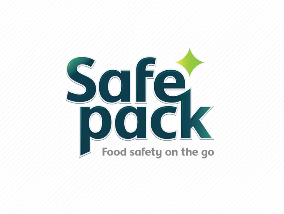
Typography in Focus: Safepack's Branding Journey
As a creative agency, we embarked on an inspiring journey with Safepack, a distinguished manufacturer of food-grade disposable plastic food boxes. Our mission was crystal clear: to revitalize Safepack’s identity and infuse it with a modern essence. We understood that every curve, every line of typography was a vital element in crafting a new image for Safepack, one that radiated cleanliness and hygiene—an indispensable quality in the food industry.
Typography as the Artistic Anchor
Our creative journey began with an exploration of countless typography options, each one meticulously analyzed. We aimed to ensure that Safepack’s typemark stood out, a reflection of its commitment to food safety and quality. It wasn’t just about a logo; it was about creating a typography that would convey Safepack’s precision and dedication to providing food-safe solutions.
Radiating Hygiene
The Safepack typography goes beyond mere letters; it serves as an assurance of purity. Every element of the typography, including the ‘sparkle’ visual element, was thoughtfully chosen to communicate hygiene and quality. It’s an invitation to explore Safepack’s range with the confidence that your food is preserved in pristine conditions. Safepack is not just a brand; it’s a commitment to your health and safety.
A Journey of Dedication
The rebranding process was a labor of passion, a collaborative effort between Safepack and our creative minds. It took several years to complete, and every modification of the typemark was a testament to our unwavering commitment. We invested our creativity and expertise to ensure that the new identity would stand as a timeless symbol of Safepack’s dedication to purity and quality.
A Brand of Assurance
The Safepack rebrand has not only captured attention but has also set new standards in the food packaging industry. Our typography now stands as a symbol of trust and quality. The rebranding journey has been a remarkable success. Following the launch, Safepack experienced a significant boost in its market presence, demonstrating the power of a strong, meaningful identity.
Safepack: Where Cleanliness Meets Convenience
Today, Safepack stands as a brand redefined by creativity and dedicated expertise. Our typography is a testament to the meticulous craftsmanship and passion invested in every detail. It embodies the core values of cleanliness, safety, and quality that we aimed to instill in the brand. We invite you to explore Safepack’s product range and experience the essence of food preservation, where hygiene meets convenience—an accomplishment achieved through typography that was carefully crafted with heart and soul.”
Project Scope
Identity design
Logo creation
Packaging design
Messaging and tone-of-voice
Brand guidelines
Implementation and roll out